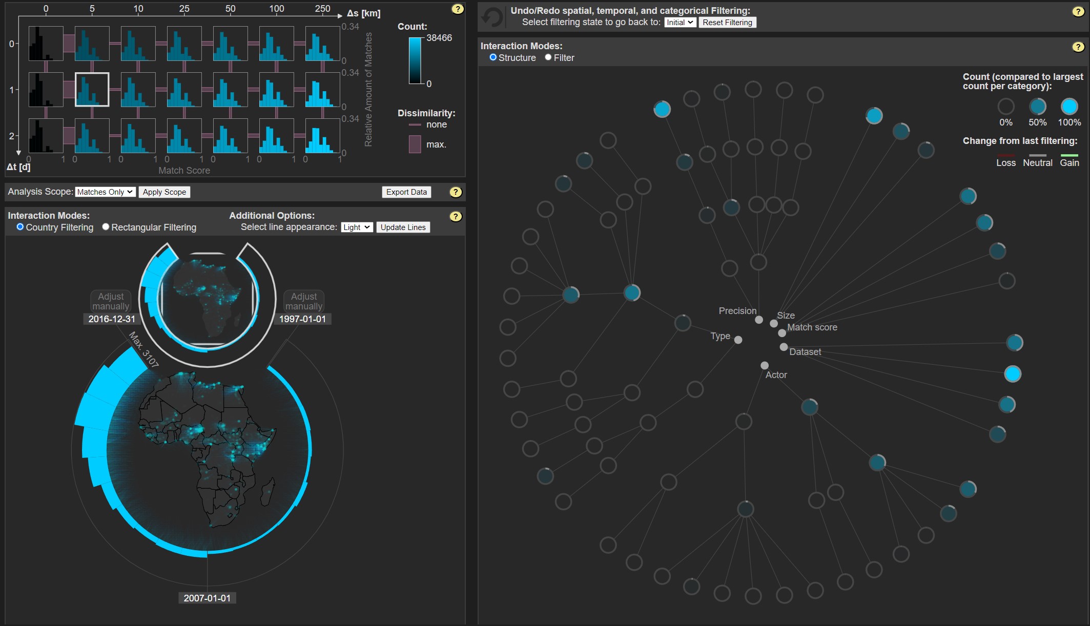
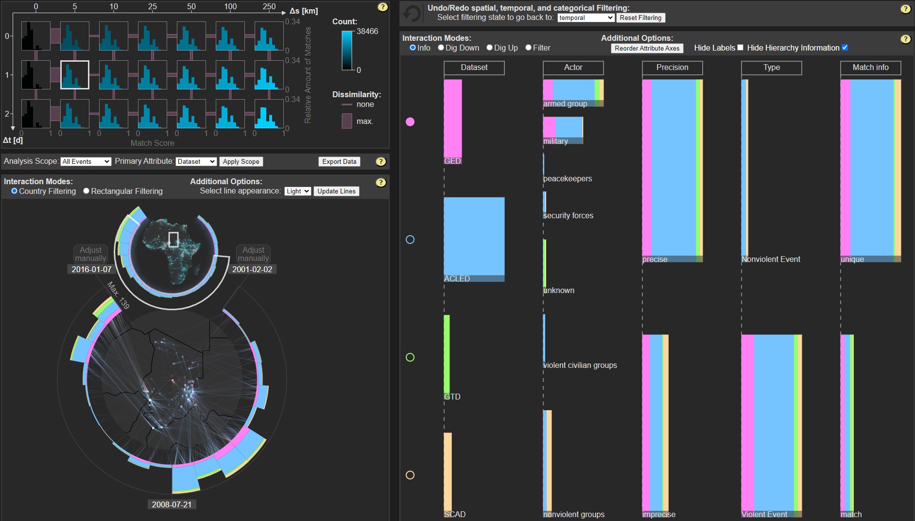
In this project, the goal was to explore the results of a statistical conflict research method. The method was used to integrate several spatio-temporal conflict event data sets based on a set of assumptions. As the integration method produced unexpected results, we used visual exploration to better understand what was happening under the hood.
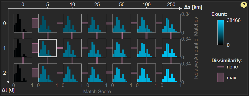
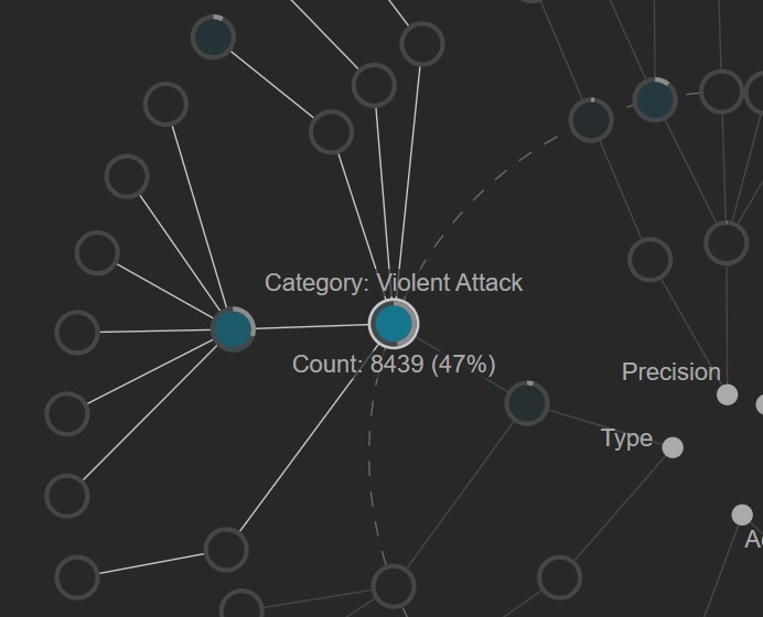
To produce the corresponding visualization system, we developed a deeper understanding of how the integration method works to identify the aspects relevant for further exploration. We designed and tested various visualizations to identify the most suitable ways to represent the multi-faceted information contained in the integration results. The visualizations were linked, so they could be explored in synchrony via filtering and changing parameters. The development process took place in close collaboration with conflict research experts.
With the final system, we could successfully identify multiple reasons for why the integration results looked the way they did.
Disclaimer: As this was my first major project and all the calculations are performed client-side, the application takes some time for certain steps, depending on which computer it is opened on.
Publication: B. Mayer, K. Lawonn, K. Donnay, B. Preim, and M. Meuschke. “VEHICLE: Validation and Exploration of the Hierarchical Integration of Conflict Event Data.” In: Computer Graphics Forum 40.3 (2021), pp. 1–12. doi: 10.1111/cgf.14284.
| TYPE | Visualization system, Dashboard |
| TECH | JavaScript, D3.js, R |
| ROLES | Conceptualization, Design, Implementation |
| YEAR | 2021 |
| PARTNERS | Otto von Guericke University Magdeburg, University of Zurich |


